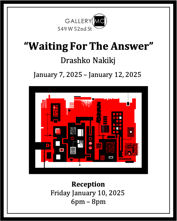
Waiting For the Answer- Drashko Nakikj
Reception on Friday, January 10th from 6 to 8pm
Introduction
I do abstract digital art that can be printed in various formats and on different materials. In my work, I like to explore the power of combination and reusability. I’m impressed how a small number of elements and interaction rules can produce an abundance of variety. I draw a lot of inspiration from my scientific work about understanding patients’ needs and using that knowledge to design applications.
In human-computer interaction science, we dig deep to understand a small set of user needs that combined together result in a variety of observable behaviors and preferences. The goal is to meet these needs with a user interface. In designing user interfaces, we combine user controls and lay them out in a specific way following rules and guidelines. This user interface becomes unique for each of the thousands of software applications, despite being derived from a relatively limited pool of user controls and rules for arranging them. Similarly, in health data visualization, there is a small set of visual encodings and rules that can be applied to the underlying data. These are able to produce renderings that surface meaningful patterns and tell truthful stories about millions of individual patients and large numbers of patient populations. Finally, to disseminate scientific work and compose a manuscript, we rely on domain specific vocabulary and common grammar. Different subsets of words from this limited vocabulary are used for writing millions of manuscripts. The words from these subsets are used with repetitions and different ordering based on the same grammatical rules.
The idea of combining a limited number of elements following a set of rules is not new to visual art. This is noticeable in well-known artists like George Seraut (pointillism) and Piet Mondrian (suprematism). Both live on the opposite end of the spectrum. Seraut uses only circles – one size dots made with a brush, but with a huge variety of color. The arrangement of these dots has practically no restrictions. On the other hand, Mondrian uses rectangles, squares, and lines, in various sizes and thicknesses. However, he does this with a very limited color palette: yellow, red and blue. In his work, these elements can have only horizontal and vertical orientation.
These examples demonstrate a wide spectrum for experimentation with the number and type of elements and the strictness of the rules for putting them together. Within this spectrum, my work is based on a unique combination of a limited color palette, small set of basic visual elements, and rules for complex element generation and their arrangement. There are three themes I explored so far that are elaborated individually in the text that follows.
Theme 1 – pattern, surprise, asymmetry
Overview
In this theme, I rely on a large number of complex elements and several restrictions for arranging them. I use a small color palette, typically 3 colors. I mostly use white, red and black, but also orange, yellow, purple, pink and blue. The emphasis is on viewer’s interaction with the art piece through: a) wayfinding based on pattern recognition, surprise, and asymmetry, and b) making a connection between the title and the image. Additionally, the viewer is expected to go through a variety of feelings and emotions as a consequence of the wayfinding and the title to image mapping.
The art creation process
Colors
The most prevalent colors in my work – white, black and red represent happiness, sadness and passion. However, my goal is to produce element arrangements such that these colors trigger emotional states and feelings different from the default ones. This gives the colors transient and fluid meaning, which provides experiences that are typically associated with a richer color palette.
Alphabet
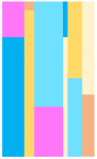
I will draw analogy to language when explaining how my artwork is being generated. For basic elements i.e. letters in my alphabet, I only use vertical and horizontal lines with different widths, rectangles in two orientations – vertical and horizontal, squares that can’t be inclined, as well as circles. The lines and shapes can have different lengths and sizes, respectively. By using these three types of letters, I can introduce intense contrast and enough variety to achieve vibrancy and playfulness when creating more complex elements and when those get arranged in a composition.
Figure 1. Example of letters constrained to lines, rectangles, squares and circles, oriented only vertically or horizontally.
Words and phrases
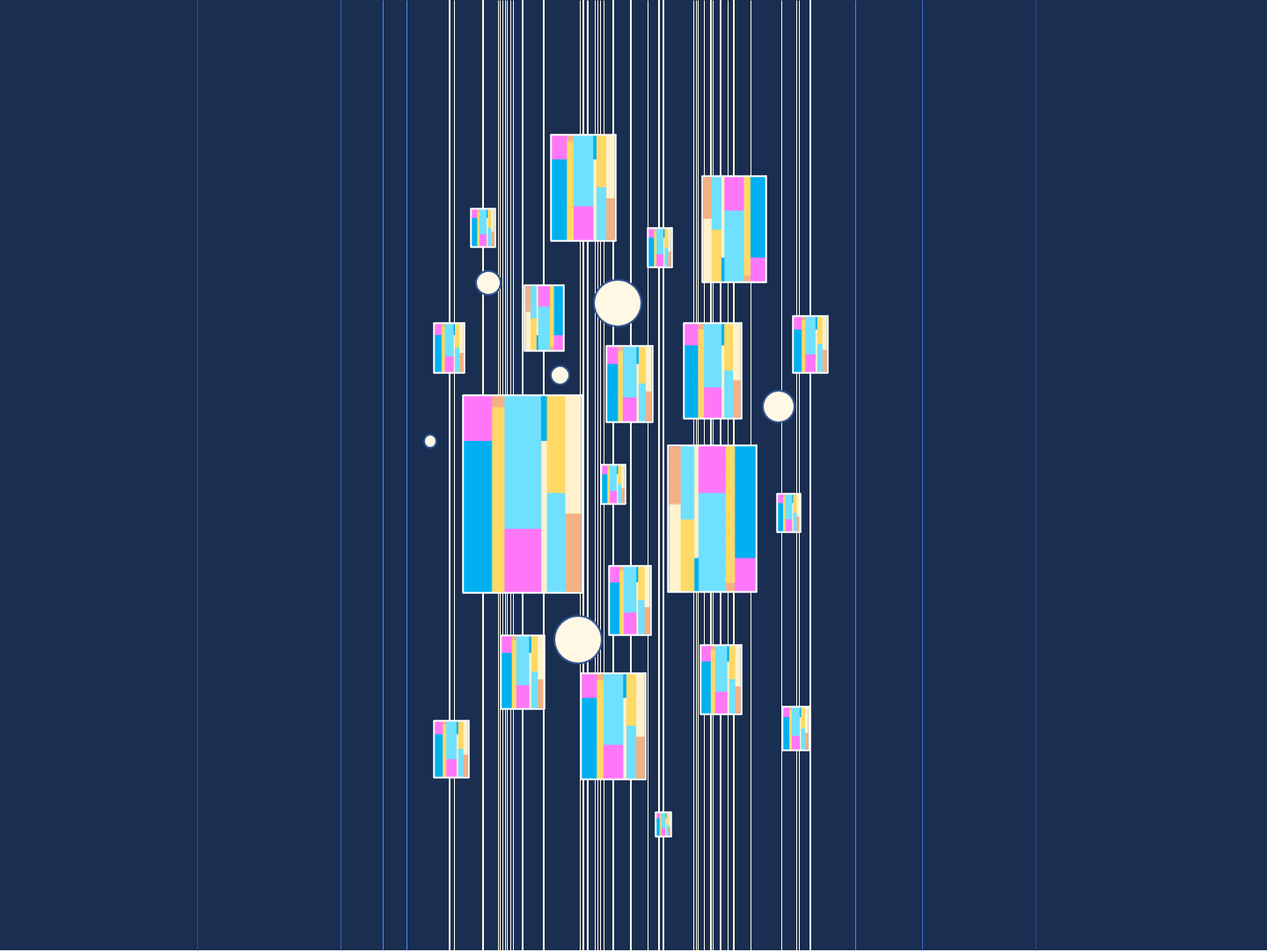
These more complex elements produced from the alphabet are analogous to words such as the ones below. Just like in the spoken language, the words can be combined in phrases. The words and phrases are reused within the same art piece or in other art pieces.
Figure 2. Example of words made from the letters from Figure 1.
Figure 3. Examples of phrases composed from the words in Figure 2.
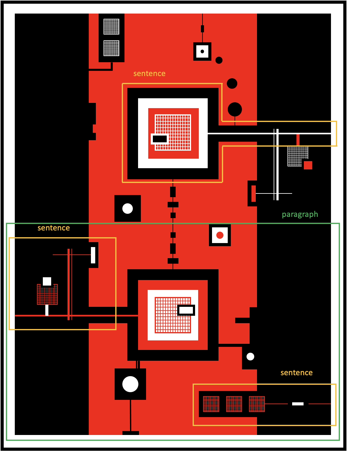
Figure 4. Examples of 3 sentences marked with yellow rectangles, and a paragraph marked with a green rectangle.
Sentences and paragraphs
From the words and the phrases I combine sentences that are organized in paragraphs. The paragraphs are segments of the image that tightly coexist together and produce a coherent point of attention that often conveys a concept or a message.
Viewer engagement
Breaking expectations
The paragraphs and the sentences within the art pieces are arranged such that the viewer is constantly interested to parse them in different ways. This prolonged engagement is achieved through breaking the strong human propensity to draw parallels to the familiar, find patterns, enjoy symmetry, and get alerted when surprised.
To achieve playfulness and intrigue in the layout, the paragraphs are usually in the confines of a negative space – a broken shape that we as humans are used to seeing. This approach intrigues the viewer to ask questions such as why is there a missing piece, where is the missing piece, or guess the complete shape that was “damaged”.
When the viewer looks at the image, they see an underlying pattern that gets broken at some point. This leads to the viewer questioning themselves whether they’re looking for the right pattern, if they are missing out on something, or maybe the part that breaks the pattern is actually part of another pattern.
Further, in this pattern detection cycle, the viewer usually gets surprised by a visual word that triggers them to ask the question “But why is this here?”. Consequently, they get inspired to enter the image from another point of view and look for new patterns and find an explanation for the surprise.
Finally, there is a sense of symmetry in the image, but once that gets established there is always something missing to make it perfect. This creates connection to the image in a profound way as humans thrive for perfection, but can’t really find it – it feels like the image empathizes with that and befriends the viewer.
Feelings, emotions and personalized journeys
Through this exploration and discovery the user also experiences many contrasting feelings: success and disappointment, curiosity and stability, intensity and calmness. However, these are the feelings that are universally present for every art piece. The other feelings stem from the name of each individual artwork. The goal is to find connections between the title and the image. The viewer enters a fun and engaging exercise in which they subjectively attempt to expand the title into related concepts and then map those to individually defined image segments. As the viewer tries to find connections between the title and the image, the image serves as a brainstorming tool that helps them unpack the title further, and as the viewer unpacks the title further, they look for more connections between the new concepts and the image, and the cycle continues. This leads to a different, personalized storyline for every viewer that takes them to a unique emotional journey.
Theme 2 – pattern repetition and constrained directionality
Overview
In this theme I put emphasis on repetition and directionality through regular geometric shapes, oriented vertically or horizontally. I use a medium number of elements, medium amount of restrictions, and variety of colors.
In this theme, the subject of repetition is a pattern. The pattern is created such that it represents the main concept of the art piece. The background, the lines and the auxiliary elements are used to represent the other concepts in the art piece, set up the ambiance, demonstrate motion and capture mood.
The art creation process
Patterns
The pattern must have a shape of a square or a rectangle. I typically use one, but sometimes two patterns within the same art piece. The pattern gets repeated in various sizes and two orientations – horizontal and vertical. However, in some works the pattern orientation can’t change so it stays either vertical or horizontal.
When I use two repeating patterns, they have different colorings and don’t require auxiliary rectangular or square elements for playfulness. However, the presence of circles is still used to boost the contrast and the dynamic in the art piece.
Auxiliary elements
Rectangles, squares and circles
The primary role of this type of auxiliary elements is to break the monotony of the repeating pattern. However, they have a secondary role as well, which is to represent concepts related to the title of the art piece. While the presence of auxiliary squares and rectangles varies from art piece to art piece, the circles are almost always present. The auxiliary elements can have different sizes and different orientations – horizontal and vertical. These auxiliary elements are typically monochromatic, but in rare occasions can have multiple shades of the same color.
 |  | |
 | ||
Figure 5. Pattern, auxiliary element and background with lines that are combined in an image.
Background and lines
The background is key for capturing the mood and setting the stage for the art piece. It is typically tied to a major concept related to the title of the work.
To add anchoring to the patterns and the auxiliary elements, I use vertical or horizontal lines that give the illusion they are not floating but “holding” onto something. These lines are responsible for pointing out motion in some of the works, emphasizing the color with important meaning to the art piece, or even representing a concept related to the main one.
Example
In Figure 5, I show a pattern for representing the advertising screens at Times Square, circles to represent very bright lights and add playfulness, background to show it is nighttime, and white lines to emphasize the brightness and intense movement.
Viewer engagement
With the approach in this theme, the objective is to mimic the experience that we have when we see something impressive. The perceived objects are constantly repeated in our minds with different levels of prominence, wrapped with a predominant color that sets up the ambiance and captures the mood.
Theme 3 – shape repetition and unrestricted directionality
Overview
In this theme I focus on repetition and directionality through hand drawn geometric shapes. This is done with an extremely small number of basic elements – mostly one, but up to three. There are very strict rules on how complex elements are generated, but there’s no limits in how those can be arranged.
The art creation process
Basic elements
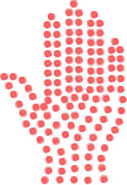
Typically, I use only one shape that represents the basic element and has been created with a free hand on a touch mouse pad. That shape then gets repeated numerous times through more complex objects to complete the art piece. On some occasions I use more than one hand drawn shape but no more than three.
 |  |  |
Figure 6. Examples of hand drawn shapes.
Complex elements
For creating a complex element only one basic element can be used, with repetition. When creating complex elements, the basic elements can only change size, but can’t change proportions. The complex elements represent objects. Most of the time the objects are completed only through basic element repetition. However, on rare occasions objects are finished by adding very few basic elements that have not been repeated but are still hand drawn. The objects that are repeated can be arranged in any direction, along any form of path, and should not necessarily follow the horizontal-vertical orientation restriction present in the previous themes.
Example
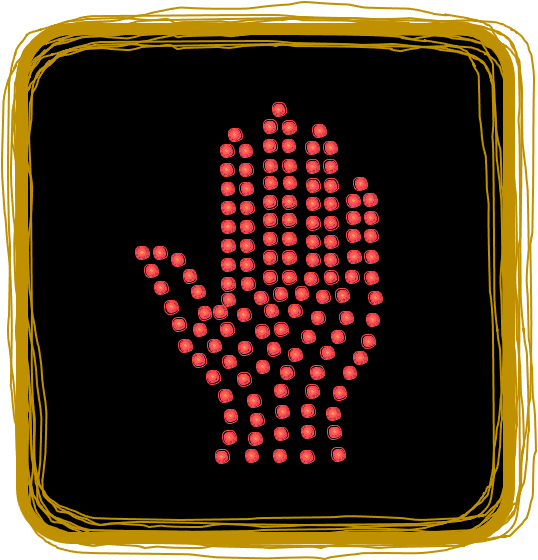
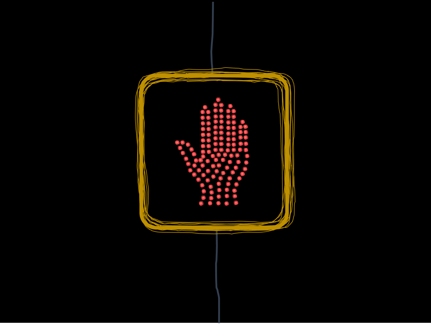
In Figure 7, we can see how the “don’t walk traffic light” was created. We can see a basic hand drawn circular shape that was used to produce an individual light source. The individual light sources are combined to make the hand. We can also see a basic hand drawn square shape that was used to create the outlines of the yellow metal box for the traffic light and the dark background. The hand and the yellow metal box are combined to represent the stop traffic sign for pedestrians. Finally, a non-repeated blue hand drawn line adds anchoring to the traffic sign.
|  |  |  |
|  |
Figure 7. Examples of basic hand drawn shapes combined into objects: a) circle into individual light, individual light into a hand, and b) square into a yellow metal box. These two objects are combined into a stop sign for pedestrians. This object is finished by an anchoring blue line.
Viewer engagement
This theme forces the viewer to think how complex things can be boiled down to an extremely small number of basic elements. On top of this, it surfaces and then amplifies the power that combination and repetition bring. The idea is that after the viewer interacts with a number of pieces from this theme, they continue to think about breaking down complex concepts and problems from their everyday life down to the basics, find overlaps and common denominators, and potentially get a new angle for looking at things that also has unifying properties.